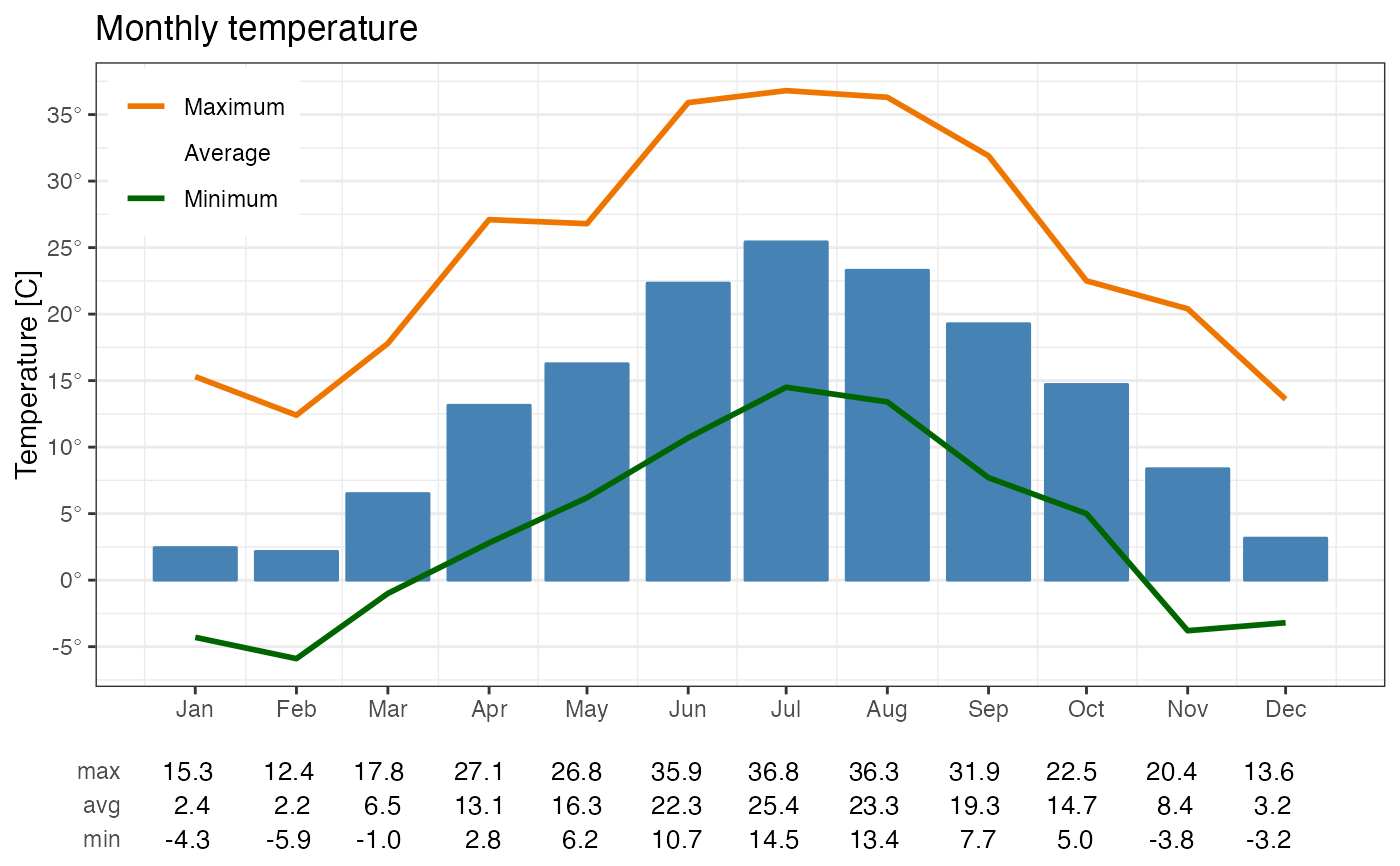
plotAvgTemp builds a bar plot of time average temperature and two
line plots with maximum and minimum temperature.
Usage
plotAvgTemp(
  mydata,
  temp = "temp",
  avg.time = "1 month",
  ylabel = NULL,
  title = "",
  locale = NULL
)
Arguments
- mydata
dataframe with data to plot. date and time column must be named as "date".
- temp
Name of the column representing temperature (default = "temp")
- avg.time
Defines the time period to average to. Currently the only supported period is "1 month" (default).
- ylabel
The label along y axis
- title
Optional plot title
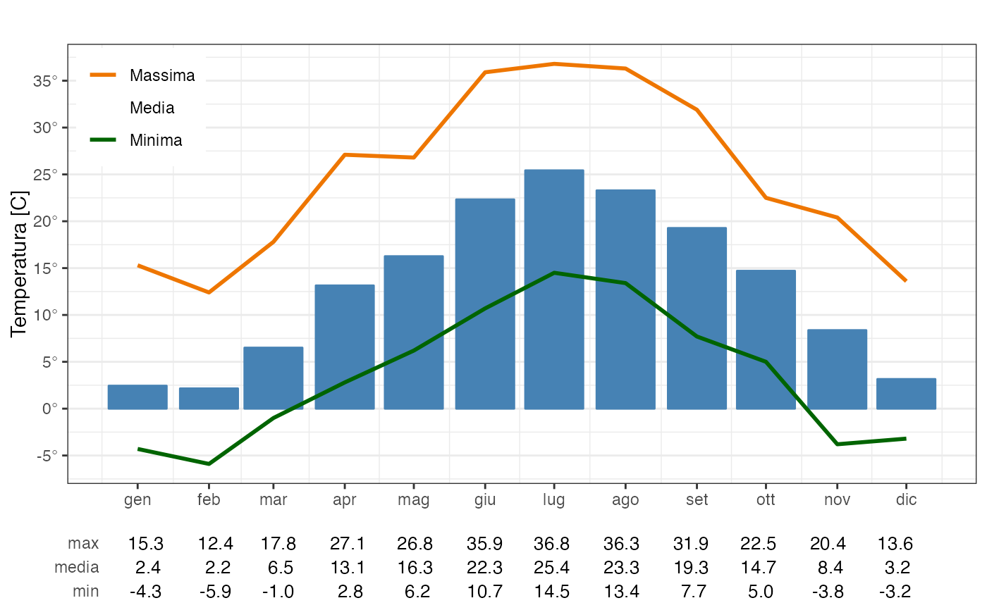
- locale
Locale to use for day and month names. Default is current locale. Supported locales are listed in stringi::stri_locale_list(). All other labels are in English by default or in Italian if its locale is specified.
Examples
# Plot histogram with monthly averages together with maxima and minima
# curves
data("stMeteo")
plotAvgTemp(stMeteo)
 plotAvgTemp(stMeteo, temp = "temperature",
avg.time = "1 month", ylabel = "Temperatura [C]")
plotAvgTemp(stMeteo, temp = "temperature",
avg.time = "1 month", ylabel = "Temperatura [C]")
 # Override default locale
plotAvgTemp(stMeteo, avg.time = "1 month", locale = "it_IT")
# Override default locale
plotAvgTemp(stMeteo, avg.time = "1 month", locale = "it_IT")
 # Add title
plotAvgTemp(stMeteo, title = "Monthly temperature")
# Add title
plotAvgTemp(stMeteo, title = "Monthly temperature")